It’s a new year, so there’s no better time to clean out my email box and answer a few JLA-related questions that readers have sent me over the past two months. There are quite a few, though, so I’ll split them up. Today, I’ll answers questions relating to the artwork.
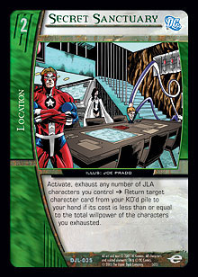
Why are there JLI characters in the art for Secret Sanctuary, a JLA location? – T.C.
 Before the JLI had embassies spanning the globe, their headquarters was the Secret Sanctuary. The JLA abandoned it after Snapper Carr revealed its location to The Joker. The card was originally going to be a JLI location. However, during playtesting, the JLA became the more location-oriented team, so they needed a couple of extra locations. Note that Elongated Man is in the art anyway, as he hung out with the team a fair bit (mainly owing to the fact that his wife, Sue Dibny, was a part of the JLI). You can see him on her card, as well.
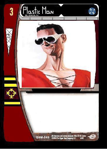
Who came up with the Plastic Man alternate art concept? It’s my favorite art and card in the set! – S.T.
It was my idea to make him the alternate art. I even put together a crappy Paint version of him as a concept for DC’s approval. My idea was that he would be hiding in the border of his own card, with his belt buckle as his range icon. DC approved the concept but made it a whole lot better by making Plas the whole card. I can really only take credit for printing his name on his glasses.
Check out my original concept.

The JLA shirt is my favorite! Who picked that orange? – B. T.
Okay, this is sort of an art question . . . When a new expansion is on the horizon, UDE orders ten or so pieces of advance art to be used in promotional items, booster foil wraps, deck boxes, shirts, and so forth. For the JLA shirt, we didn’t want to use Superman or Batman, as they had already been featured on shirts. This limited our options. Our first shirt concept featured The Flash, but the art was not quite what I’d want to see on a shirt. Plus, I don’t think he screams “JLA” when you see it.
The Alex Ross piece was not originally part of the advance art order. It had been in house practically since the beginning of time. I had forgotten that is was considered advance art, since it wasn’t on the list. We scrambled to get it approved and then chose a nice burnt orange color to put Aquaman on. For some reason, the orange came back from the printers a bit brighter than we expected. We’re glad that some people like them a lot.
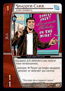
What’s the Easter egg with Snapper Carr? There has to be an inside joke there. – C.V.
You ain’t kidding. Ooh, boy. I was hoping no one would ask about this one. Funny story . . .
 Way back before JLA art requests were even being dreamed about, Jeff Donais mentioned one day that he’d really like to get a card named Passionate Melody in a set for his brother Mike. I quickly poo-poo’d the idea so that he’d think I’d never do it. I knew I couldn’t get it in as a card name, but I certainly could get it in as an Easter egg.
Figuring that Melody must be Mike’s wife’s name, I decided to make it a bit cheeky. I mean, if he wanted to call her out as “passionate,” I figured I’d join in on the fun by including the “on the mike!” bit. When the cards were built by our pre-press department, Jeff finally got to see it. It was only at this time that he informed me that Melody was not Mike’s wife, but one of his two daughters. The other one is named Passion. If I had ever before heard of anyone being named Passion, the thought might have crossed my mind. Wanting to salvage something of the Easter egg, I came up with the version name “Cool Daddy-O” to get across the dad aspect of an otherwise non–dad-like card. Sometimes, the best intentions come back to bite you. But we did all have a good laugh about it.
Whose hands are tearing the JLA group shot on Disband the League? – M.G.
As if the waterworks weren’t enough of a clue, the hands belong to Aquaman. He was the one who called for the disbanding, so it seems only fair to show his hands and to have him be the one speaking the flavor text.
How is the airspace over the Golden Gate Bridge a Field of Honor? – R.L.
Sometimes, the best laid plans get shot all to heck. The card was originally a combat plot twist. The art concept is taken from the cover of Secret Society of Super-Villains #5. Sinestro is wreaking havoc, so Hawkman comes after him. However, when the concept on this card was transferred from the JLI (it used to be on Staged Attack) to the JLA, we wanted it on a location. Field of Honor is the kind of card that you only need to have one of in play, so putting four in a deck is unlikely to happen. Since the JLA already had location searching in New Era, it was decided to move this concept to a JLA location. I didn’t have a specific piece of art for it, though. With very limited options, I found this piece featuring two honorable warriors. Well, at least Sinestro is honorable in his own mind.
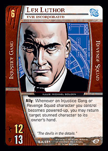
Did you put “Seck Industries” in the art description for Lex Luthor, Evil Incorporated, or is that something random the artist did? – TBS
 Yes, R&D’s own (The) Ben Seck came to me yesterday to say that he finally saw this Easter egg. A friend had mentioned it to him. Wow . . . two months is a pretty slow burn. So yes, TBS, I did put your name in the art description. And that makes you the devil.
I love the art in the JLA set. What’s your favorite card art? – Various
You could guess my favorites from looking at the boxtoppers. My favorite is probably Scarecrow, Psycho Psychologist. I had that as my wallpaper from the moment the art came in last year. However, sometimes I like looking at the art on Maxima more. Not sure why. Must be because I came up with the awesome flavor text.
My favorite art concept is Criminal Mastermind, as it’s one of the few that I wrote (Ben Kalman did ninety-five percent of them). I had that image in my head for a long time, and I’m very happy with the results.
You made a mistake with the World War III card. The Injustice Gang characters that were present with Mageddon are Prometheus, Queen Bee, Lex, and The General. – H.J.
Good eye. Yes, sometimes in an art description, it pays to be very specific when you describe a showdown in space between various members of the JLA and the Injustice Gang.
The cards Darkseid, Heart of Darkness and Lex Luthor, Criminal Genius look like they are supposed to be side-by-side stackers. But they don’t line up. What gives? – H.J.
Again, good eye. When our pre-press department builds the cards, they crop, reposition, refocus, and otherwise edit the artwork. You’re not seeing the whole image. I never tried to put the originals together, but I’m guessing that it would work.
That’s enough for this week. More easily digestible tidbits from the JLA next week.
Send questions or comments to mhyra@metagame.com.